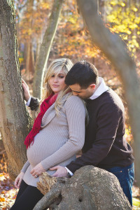
here’s my entry for the latest chic critique cover contest. i tried to follow the guidelines closely: showcase female subject, serious facial expression, upper body image, room for title and blurbs, clean edit, good lighting and posing, not over-sharpened, color image. wheeew! i love this image. whether it makes cover, runner up, honorable mention, or nothing, i am still very pleased with this capture. =) if you haven’t already checked out Chic Critique you need to do it. now. so much inspiration in one spot, it’s almost overwhelming!
chic critque cover contest | potomac maryland maternity photographer
bethesda maryland maternity photographer, chic critique, maternity, potomac maryland maternity photographer, rockville maryland maternity photographer
COMMENTS


